Behavior & Burnout Kit
Sales Page Conversion Audit
The PDF is the original September 22 version and does not include this update.
September 26 update
The live page was re-read on September 26 and compared against this audit. Nothing on the live page was changed.
Clarity, last 7 days
- 4 of 41 sessions on the main page reached checkout (Clarity funnel). The checkout event fired in 16 sessions overall.
- Average scroll of 37% means most visitors never reach the value stack or price close.
- Dead clicks: 17 sessions tapped something that did nothing. Watch recordings to find which element.
- One PC in the United States accounts for 14 sessions, so counts run high. JavaScript errors (4) are Facebook and Instagram in-app browser noise, not page defects.
- Traffic is intentionally low while the page is tuned. Treat these as direction, not proof.
Resolved on the live page
- Interior pages shown. The hero shows six real inside pages; the value stack has resource previews.
- Volume stated. 200+ pages, 190+ cards, and counts on every value-stack line.
- Creator named. Kimi's name, photo, and credentials are on the page.
- How It Works. Now Behavior, Response, Support.
- Flash sale. $97 to $47 with a live countdown and the Monday, October 5 deadline.
- Value stack. Rebuilt around six real resource groups with one price close.
Still open
- Repeated arguments. Two cost sections ("When Your Team Does Not Have A Clear Plan" and "What Is The Cost Of Not Having A Plan?"), and "not a printable pack" twice.
- "Lifetime." Still in the hero badge, the FAQ, and the final button line. Decision was "updates for the life of the product."
- No customer proof. No reviews or center results yet.
- No page title or share tags. Browser tabs show the bare URL.
- Mismatched label. "Why I Created The Toolkit" sits over a heading about team problems.
- Low scroll. With a 37% average, the offer needs to show up earlier or the page needs to get shorter.
Scores and the scroll-by-scroll sections below are from September 22 and describe the page as it was then.
| Category | Score | What is driving it |
|---|---|---|
| Above the fold | 21 / 25 | Strong CTA and mockup. Headline does not say what the product is or how much is in it. |
| Copy and messaging | 16 / 20 | Problem named in the abstract. Same arguments repeated three times. |
| CTA and conversion path | 19 / 20 | One offer, one price, six buttons, no competing asks. This is the strongest part of the page. |
| Trust and social proof | 1 / 15 | No testimonials, results, guarantee, or contact. The credential block carries all of it. |
| Design and UX | 10 / 10 | Clean, branded, consistent. Mobile renders; a full mobile pass was not done. |
| Technical | 9 / 10 | Fast, tracked. No page title or share tags on any of the three pages. |
How this was done: the live page was fetched and screenshotted at desktop and phone width, all six product videos were pulled and frame-sampled, the checkout and thank-you pages were read, and the Meta Pixel and Clarity tags were checked on all three steps. Nothing on the live page was changed. Scores use the landing-page-auditor rubric (25 / 20 / 20 / 15 / 10 / 10).
Two separate lanes. The page and the checkout in GoHighLevel belong to the GHL person. Ads, audiences, and the Meta Pixel are a separate lane, handled apart from the page work. Nothing in this document asks the GHL person to do anything on the Meta side.
Decisions already made by Kimi and treated as fixed throughout: the Brunson-style structure stays. The value stack stays. The cover art on the resource cards stays. There is no money-back guarantee (digital product). Page counts are stated as "over 40" style figures, not exact numbers, because the kits keep growing. The sale price is $47. How It Works is Behavior, Response, Support, the organizing logic used in the kit and the hub. The kit is print-first: a printout, with no phone or screen framing anywhere on the page. The sale ends Monday, October 5, 2026. One license covers every classroom in a building. "Lifetime" comes out in favor of "updates for the life of the product." The three ever-growing libraries carry no page count. No returns policy or "not a fit" language.
1. Conversion Diagnosis
Five reasons a qualified director lands on this page, gets interested, and still does not buy. They are ranked by how much revenue each one is probably costing.
1. The visitor never sees inside the kit
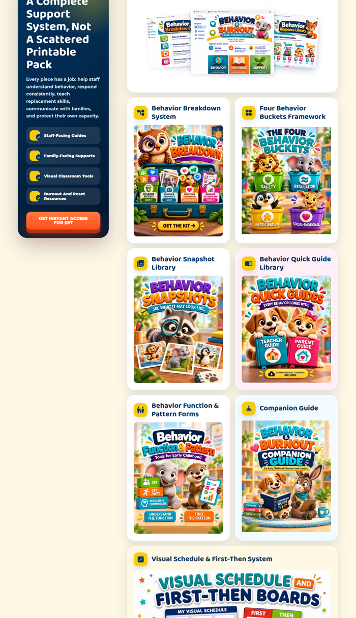
All ten resource cards show a designed title graphic, the equivalent of a book cover. There is not one interior page anywhere on the page. The interior pages do exist, but only inside six videos that run 8 to 17 seconds, and the real content in those videos occupies the middle 45% of the frame with blurred filler on both sides. A visitor who does not press play never sees a single page of what $97 buys. For a buyer whose reference point is Teachers Pay Teachers, where every listing sells on interior previews, this is the biggest single leak.
2. There is no volume anywhere on the page
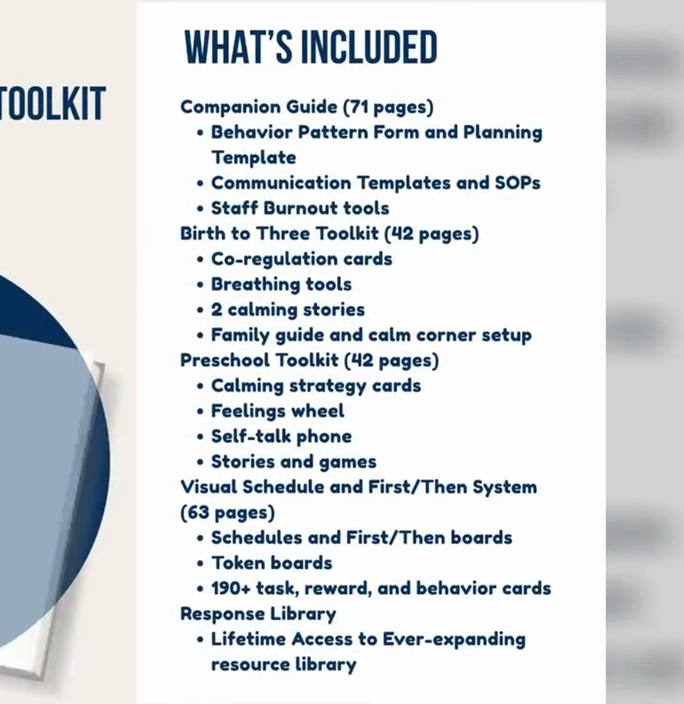
The only numbers on the page are prices. No page counts, no card counts, no file counts, no "everything you get" total. The checkout page repeats the problem: "What You Get Today" is ten checkmarks with nothing behind them. A "What's Included" slide with every count already exists, approved, inside an 8-second video: Companion Guide 71 pages, Birth to Three 42, Preschool 42, Visual Schedule and First/Then 63, 190+ cards. That is over 200 pages that the page never claims.
3. Zero proof and zero risk reversal
Trust and social proof scores 1 out of 15. No testimonials, no center results, no guarantee, no support contact. The school psychologist credential block and the sneak peek are doing all of the trust work. A guarantee is off the table, so the page has to earn trust with what it shows (interior pages, counts, the sneak peek) and with plainly stated answers (format, access, license, who to contact). Silence on those reads as risk.
4. The page argues two points five times
Cost of behavior appears twice ("The Real Cost Of Challenging Behaviors" and "What Is The Cost Of Not Having A Plan?"). "This is not a printable pack" is claimed three times. The teachers-stay, children-benefit, families-notice chain runs in the hero, in "Now Imagine A Different Story," and again in "Better Systems. Better Teachers. Better Outcomes." Momentum drops on each repeat because the visitor is scrolling without learning anything new. The page is long, but it is not long because it has a lot to say.
5. The problem is abstract
"Challenging behaviors" is the phrase doing the work almost everywhere. The behavior itself is described once, in one card. Staff loss, the strongest business angle, also gets one card. The chain the page needs to make, child behavior to staff response to burnout to turnover to enrollment, is asserted in the subhead but never walked through in a way a director can recognize as her own building.
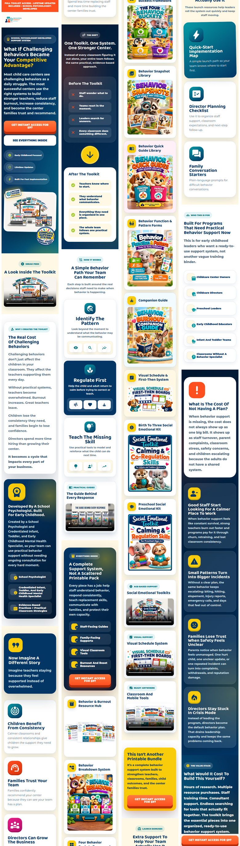
6. On a phone it is 26 screens long
The full page at 390px width is about 22,000 pixels tall. The ten resource cards alone are ten screens, because every cover sits one per row at full width. The six role tiles, the four cost cards, and the four "imagine" cards are one box per screen, each holding one icon and three lines inside a lot of padding. On desktop the hero stacks the headline, two buttons, and three pills down the left and leaves the right side empty below the mockup. The page is not long because it has a lot to say; it is long because everything is one per row with room around it.
<title>, a meta description, or Open Graph tags. Every shared link and every browser tab shows a bare URL. This is a ten-minute fix that touches every ad click and every DM share during the sale.2. Keep / Kill / Fix / Add
| Verdict | Element | Why |
|---|---|---|
| KEEP | Hero headline question | Intentional positioning: business solution, not a behavior binder. The fix is in the subhead, not the H1. |
| KEEP | Sticky top bar with CTA | Visible CTA at every scroll depth. During the sale it becomes the timer bar. |
| KEEP | Single CTA, price in the button, six placements | The strongest thing on the page. No competing asks, no form on the page, direct to checkout. |
| KEEP | Hero product mockup and badges | Reads as a real product. The lifetime access badge is the right claim to make first. |
| KEEP | Credential block (school psychologist, credentialed IT/EC mental health specialist) | Currently the only proof on the page. Keep, and give it a face and a one-line reason the kit exists. |
| KEEP | Before / After table | Text only, scannable, no ad-platform risk. Does its job in five seconds. |
| KEEP | Value stack with $1,970 anchor | Stays by decision. It gets stronger when volume is added to every line. |
| KEEP | Cover art on the resource cards | Stays by decision. Covers become the card header; interiors get added beneath. |
| KEEP | Launch bonuses, Who This Is For, FAQ format | All doing their jobs. FAQ needs four more questions, not a redesign. |
| KILL | "Better Systems. Better Teachers. Better Outcomes." section | The hero subhead said a third time, right before the FAQ. Cut it, or hold the slot for real proof when it exists. |
| KILL | The heading "A Simple Behavior Path Your Team Can Remember" and the three-card diagram under it | Hokey, and the steps are in the wrong order. Replaced by the kit's own Behavior, Response, Support framework. Done on the live page as of September 26. |
| KILL | The nine icon chips under the three How It Works steps | Three decorative icons per step, no information. They make the section look busy while saying nothing about the tools. |
| KILL | The current body copy of "Now Imagine A Different Story" | A repeat of the hero chain. The heading can stay; the section gets a different job (staff retention). |
| KILL | The current body copy of "This Isn't Another Printable Bundle" | Third statement of the same claim. The section gets a different job: one piece vs. the whole plan, with the format owned rather than denied. |
| FIX | "Lifetime" wording: top bar, hero pill, value stack, FAQ, and the hero badge image | "Lifetime" promises more than any product can. Becomes "updates for the life of the product" everywhere. The hero badge reads LIFETIME ACCESS / UNLIMITED UPDATES inside the image, so that one is a re-export, not a text edit. |
| FIX | Hero subhead | Names the outcome but not the product or the volume. It needs "the Behavior & Burnout Kit," "over 200 pages," and who it is built for. |
| FIX | Resource cards | Add three interior thumbnails and a volume line to every card. Covers stay as the header. |
| FIX | How It Works | Each of the three steps should show the actual tool a teacher picks up at that step. Right now it is three icon cards. |
| FIX | Value stack line items | Add volume to each line: "Birth To Three + Preschool Toolkits, 80+ pages, $494 value." |
| FIX | "What Is The Cost Of Not Having A Plan?" | Currently a second emotional pass. Becomes the business math: turnover, incident reports, enrollment, leadership capacity. |
| FIX | "The Real Cost Of Challenging Behaviors" | Becomes the one section that shows what the behavior looks like, in scenes with a clock on them, not lists of verbs. |
| FIX | FAQ | Add format, access, license, and updates. None of the current four questions answer "what exactly happens after I pay." |
| FIX | Title, meta description, Open Graph tags (all three pages) | Bare URLs in every tab and every shared link. |
| ADD | "Everything You Get" visual: contact sheet of interior pages with the over-200-page total | The single most convincing asset for this buyer. Answers "what do I actually get" in one image. |
| ADD | Flash sale bar with fixed-deadline timer, $97 struck to $47 | Real urgency with a real end. Price reverts at zero. |
| ADD | One line under the hero CTA: what happens after checkout | Instant download, where it lands, lifetime updates. Removes the "then what" hesitation at the button. |
| ADD | A support email in the footer | The cheapest trust signal available and the page has none. |
| ADD | Page counts on the checkout "What You Get Today" list | The last thing a buyer reads before paying should not be ten unquantified checkmarks. |
3. Scroll-by-Scroll Audit
The page in its actual order, as a cold visitor experiences it. For each section: what the visitor is thinking, what the section accomplishes, what is weakening conversion, and the exact change.
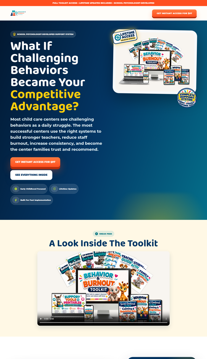
The five-second test
Two of four answers are solid. "What is this" and "why trust it" are the two the rest of the page has to earn, and they are the two it earns least.
Length on a phone
Twenty-six screens at phone width. Cutting the three repeat sections, showing covers two across, and tightening card padding takes the scroll down by a third to half without removing an argument.
1. Sticky top bar
2. Hero
3. Sneak Peek: "A Look Inside The Toolkit"
4. "The Real Cost Of Challenging Behaviors"
5. "Developed By A School Psychologist. Built For Early Childhood."
6. "Now Imagine A Different Story"
7. "One Toolkit. One System. One Stronger Center." (Before / After)
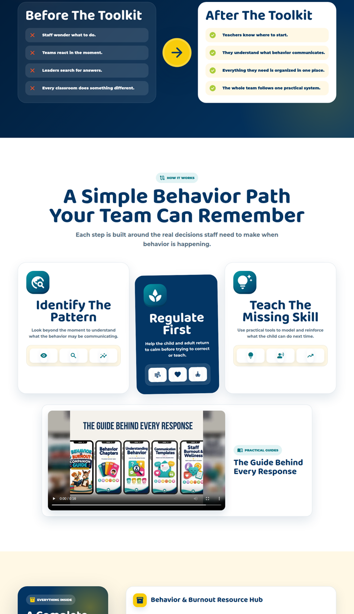
8. "A Simple Behavior Path Your Team Can Remember" (How It Works)
9. "The Guide Behind Every Response" (video)
10. "A Complete Support System, Not A Scattered Printable Pack" (resource cards)
11. "This Isn't Another Printable Bundle"
12. Launch Bonuses
13. "Built For Programs That Need Practical Behavior Support Now" (Who This Is For)
14. "What Is The Cost Of Not Having A Plan?"
15. "What Would It Cost To Build This Yourself?" (value stack)
16. "Better Systems. Better Teachers. Better Outcomes."
17. FAQ: "Simple Answers Before They Buy"
18. Final CTA: "Give Your Team The System They've Been Missing"
19. Checkout page
4. Missing Conversion Assets
The assumption under test was "the page needs more images of what is inside the kit." The evidence supports it, but narrowly: the page does not need more images, it needs a different kind of image. It has ten covers, two device mockups, and a hero flat lay. It has zero interior pages. Adding more covers would not move conversion. Adding interior pages would.
| Asset | Conversion job | Where it goes | Source |
|---|---|---|---|
| Everything You Get contact sheet | Answers "what do I actually get" in one image: a grid of page thumbnails with the over-200-page total. The Teachers Pay Teachers preview convention. | Top of the resource section, above the cards. Also linked from "See Everything Inside." | Needs source page files. Not recoverable from video at usable resolution. |
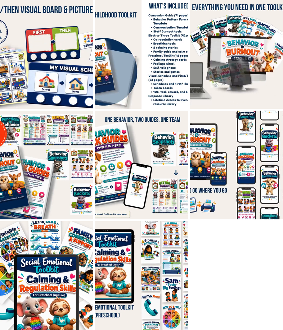
| Three interior thumbnails per resource card | Turns each cover into a product. A visitor sees a Behavior Snapshot, not the words "Behavior Snapshots." | Beneath the cover on every card. | Stills from the six videos work at this size. Eight candidates already pulled. |
| One full-width readable page | Lets the visitor judge the typography, density, and quality before trusting it. Proves it is not clip art. | Sneak Peek section, or the Everything You Get section. | Needs source page files. |
| The tool at each How It Works step | Converts the three-step path from a diagram into a demonstration. The visitor sees herself handing a teacher the form, the card, the guide. | How It Works, one thumbnail per step. | Function & Pattern Form, calming card, Quick Guide: stills exist in the videos; source files better. |
| "What's Included" counts as text | The volume story. Currently exists only inside an 8-second video. | Sneak Peek section, hero subhead, cards, value stack, checkout. | Exists. Pulled from the video already. |
| Founder line with photo | The honest substitute for testimonials: a named person with a credential and a reason. | Credential block. | Kimi: photo and two sentences. |
| Support email | The cheapest trust signal that exists. The page has no contact of any kind. | Footer, and the FAQ. | Kimi: which address. |
| Four FAQ entries | Format, delivery, license, updates. The "then what" objections at the button. | FAQ. | Copy in section 7. |
| Flash sale bar and timer | Real urgency, real end, price reverts. | Sticky bar, hero, value stack, final CTA. | Build. Needs the end date. |
| Testimonials or center results | The missing 14 points of trust. Nothing on this page can substitute for a real quote from a real director. | The "Trust Builder" slot above the FAQ. | Does not exist yet. Not to be invented. |
| Page title, meta description, OG image (three pages) | Every shared link and tab currently shows a bare URL. | Page settings in GoHighLevel. | Ten minutes. |
What the videos already contain
All six videos were frame-sampled. They are 1280×720, 8 to 17 seconds, and the real content sits in the middle 45% of each frame with blurred filler either side. Cropped stills top out around 600px wide: fine for a card thumbnail or a fanned spread, too soft for the full-width readable page. Two frames are especially useful: the "What's Included" slide with every count, and the Visual Schedule frame carrying the "190+ Visual Cards" badge.
Visuals that would be decoration, not conversion
- More covers, more device mockups, or a second flat lay of the same covers. The page has enough of those.
- Stock classroom photography with no kit in it.
- Additional icon rows, badges, or pills. The page has more of these than it needs already.
- A longer version of the same 8-second video. Duration is not the problem; content is.
5. Offer Audit
The offer, evaluated apart from the copy: does the visitor understand what she receives, why each piece matters, and why the complete kit beats an afternoon on Google and Teachers Pay Teachers?
What the visitor receives, as the page presents it today
| Component | Volume stated on page | Problem it solves, as stated on page | Value stack line |
|---|---|---|---|
| Behavior & Burnout Resource Hub | None | Not stated | $197 |
| Behavior Breakdown System | None | Not stated | $297 |
| Four Behavior Buckets Framework | None | Not stated | (in Breakdown System) |
| Behavior Snapshot Library | None | Not stated | (not itemized) |
| Behavior Quick Guide Library | None | Not stated | $394 (with Parent Guides) |
| Behavior Function & Pattern Forms | None | Not stated | (in Companion Guide) |
| Companion Guide | None | Not stated | $341 (with burnout supports) |
| Visual Schedule & First-Then System | None | Not stated | $247 |
| Birth To Three Social Emotional Kit | None | Not stated | $494 (with Preschool) |
| Preschool Social Emotional Kit | None | Not stated | (with Birth To Three) |
Ten components, zero volumes, zero problem statements. The cards give a name and a category label ("Staff-Facing Guides," "Visual Classroom Tools"). The value stack gives a dollar figure. Neither says what the piece does for a teacher on a hard day.
The same table, as it should read
| Component | Volume | Problem it solves |
|---|---|---|
| Companion Guide | 70+ pages | The director's playbook: behavior pattern forms and planning templates, communication templates and SOPs, staff burnout tools. The "what do we do as a building" answer. |
| Behavior Breakdown System + Four Buckets | Ever-growing; not page-counted by design | Sorts any behavior into one of four functions so every teacher reads the same behavior the same way. The shared-language piece. |
| Behavior Snapshot Library | Ever-growing; not page-counted by design | Pictures of what a behavior looks like in the room, so a new teacher can recognize it before it escalates. |
| Behavior Quick Guide + Parent Guide Libraries | One guide per behavior, two sides each; ever-growing | One behavior, two guides: the teacher's response in the moment and the family conversation at pickup. Ends "every classroom does something different." |
| Behavior Function & Pattern Forms | (in Companion Guide) | Understand the pattern before responding to the moment. Part of the Behavior step. |
| Visual Schedule & First-Then System | 60+ pages, 190+ cards | Transitions, which is where most of the day's incidents happen. Schedules, First/Then boards, token boards, task and reward cards. |
| Birth To Three Social Emotional Kit | 40+ pages | Co-regulation cards, breathing tools, two calming stories, family guide, calm corner setup. Support tools for the youngest rooms. |
| Preschool Social Emotional Kit | 40+ pages | Calming strategy cards, feelings wheel, self-talk phone, stories and games. Support tools for preschool. |
| Resource Hub | Ever-expanding | Where it all lives and where updates land. Print from here; each room copies what it needs. |
The Breakdown System, Snapshot Library, and Quick Guide Library carry no page count by design: they are ever-growing sets of pieces, not page-numbered documents. Every other figure is on the "What's Included" slide already.
Why the kit beats searching online
The page's answer is "a complete support system, not a scattered printable pack," said three times. The real answer is more specific and the page never makes it:
- Sequence. Behavior, Response, Support, in that order, with a tool at each step. A folder of downloads has no order of operations.
- Shared language. Four buckets and one quick guide per behavior means the toddler room and the pre-K room describe the same behavior the same way, and the director hears one vocabulary instead of eight.
- Both sides of the pickup conversation. Every quick guide has a teacher side and a parent side. Found resources cover the classroom and leave the teacher to improvise with the family.
- The adult is in the system. Burnout and reset tools for staff sit inside the same kit as the child tools. Nobody's free printable covers the teacher.
- It keeps growing, and it was built by someone who does this for a living. A credential and lifetime updates versus an anonymous PDF from 2019.
Those five points are the offer. They should replace the three "not a printable pack" slogans, once, in the objection section.
Where the offer is unclear at the button
- Format. PDF? Printable and digital? Editable? The videos show "Print & Digital" badges; the page text never says.
- Delivery. Instant download? A login to a hub? An email? "Get Instant Access" implies it and nothing confirms it.
- License. One purchase per center, or per classroom, or per teacher? A director buying for six rooms needs to know before she pays.
- Updates. "Lifetime updates" is on the page four times. How they arrive is never said, and "lifetime" itself is coming out: it promises more than any product can. The wording becomes "updates for the life of the product."
- Who to contact. Nothing on the page tells a buyer who to reach if there is a problem getting in. A support email in the footer does that job at $97. No returns policy, no "what if it is not a fit" entry; Kimi does not want that language on the page.
6. Flash Sale Structure
The discount is roughly 50%: $97 to $47. The rule for every decision below: the sale accelerates a purchase the page has already made desirable. Volume and the interior visuals establish value first; the discount is the reason to do it this week, not the reason it is worth buying.
| Layer | Change during the sale | Why |
|---|---|---|
| Sticky top bar | "Flash sale: | The one place every visitor sees at every scroll depth. It carries the deadline so nothing else has to. |
| Hero | H1 unchanged. Subhead unchanged (product, volume, format). Under the CTA, one line: "Flash sale price. Regular price $97. Ends Monday, October 5." The price in the button is $47. | The headline is positioning, not price. Putting the discount in the H1 makes the product read as a discount product. |
| Price presentation | $97 struck, $47 shown, in the bar, the hero line, the value stack, and the final CTA. Not on every one of the six buttons; the buttons say $47 and that is enough. | Four strike-throughs establish the discount. Twelve turn the page into a coupon. |
| CTA copy | "Get Instant Access For $47." Below the final CTA: "Sale ends Monday, October 5. Price returns to $97." | Same verb, same structure, new number. Changing the CTA wording mid-sale would introduce a variable for no reason. |
| Offer stack | Volume added to every line (section 3, item 15). Then the close reads: "Total value $1,970. Regular price $97. This week: $47." Three numbers, in that order. | Two anchors, not one. The stack anchors $97 as reasonable; $97 anchors $47 as the sale. Discounting straight from $1,970 to $47 makes the stack look invented. |
| Urgency | One fixed deadline for everyone, a countdown that reads it, and a price that actually returns to $97 at zero. No per-visitor timers. No "today only" without a date. | The page will sit behind approved ads. A timer that resets per visitor is a misleading claim on a destination page, and a repeat visitor notices. A real deadline is the urgency. |
| Value anchoring | Volume before price. "Over 200 pages" and the contact sheet appear above the first price mention below the fold. | The discount should land on a number the visitor already believes is worth $97. |
| Repetition | Bar, hero line, value stack close, final CTA. Four places. | Enough that nobody misses it. Few enough that the page is still about the kit. |
| Checkout | GoHighLevel product price to $47. Product name gains volume. One line: "Flash sale price, ends Monday, October 5." | The page and the checkout must match to the dollar or the visitor assumes a bait. |
| After the sale | Bar reverts, buttons revert to $97, GoHighLevel price reverts. Same day. | The next sale is only believable if this one ends. |
Retargeting during the sale (ads lane, separate from the page work)
In plain terms: Meta can show an ad only to people who already visited the page and did not buy. Setting that up means going into Meta Ads Manager, creating two "audiences" (lists Meta fills automatically from the pixel), and pointing a small campaign at them. No page changes are involved.
Both audiences below use signals the pages already send. No pixel changes are needed, and none are recommended; the tracking stays exactly as it is.
- Visited getbehaviorkit.com, no Purchase. The broad drop-off pool. Creative: the flash sale and the over-200-pages number.
- Reached /checkout, no Purchase. Small and hot. These people saw $97 and stopped. Creative: the $47 price and the deadline, nothing else.
- Self-injury language of any kind (head banging, hurting themselves). Not on the page today. Keep it off.
- Long lists of aggression verbs in a row. The existing "biting, hitting, elopement, injury reports, emergency calls" line is already approved; do not extend it.
- Per-visitor countdown timers, "today only" without a date, or a sale that visibly never ends.
- In ad copy specifically: second-person claims about the reader's state ("your teachers are burning out," "is behavior taking over your classroom?"). Meta's personal-attributes rule applies to ads, not the landing page. Same facts stated about centers in general pass.
- Anything implying a diagnosis of a child.
7. Copy Surgery
Only the pieces where replacement copy would materially move conversion. Everything not listed here stays as written. Page copy addresses the buyer as "you" and "your team," matching the existing page; that is deliberate and should not be sanitized. No em dashes anywhere.
Hero subhead
Most child care centers see challenging behaviors as a daily struggle. The most successful centers use the right systems to build stronger teachers, reduce staff burnout, increase consistency, and become the center families trust and recommend.
The Behavior & Burnout Kit gives your whole team one system for the hardest moments of the day: over 200 pages of guides, visuals, scripts, and family tools, built by a school psychologist for infant, toddler, and preschool classrooms. Built so the hardest child in the building does not cost you your best teacher, your reputation, or your next enrollment.
What it fixes: names the product, the volume, the format, and the audience in the first sentence. The second sentence is the owner's bottom line, teacher, reputation, enrollment, written as what the kit is built for rather than a promise about results. Approved by Kimi.
Line under the hero CTA (new, one line only)
Instant access. Print it for every classroom in your building.
Credential block (add to "Developed By A School Psychologist")
[Photo] Kimi Walker, School Psychologist and Credentialed Infant, Toddler, and Early Childhood Mental Health Specialist. Listed on Psychology Today.
[Two sentences: the classroom moment that made the kit necessary.]
Sticky bar during the sale
Flash sale: $97 $47 until Monday, October 5 · [countdown]
Section: "The Real Cost Of Challenging Behaviors" (full replacement)
Ask a teacher about her hardest hour and she will not say "challenging behavior." She will tell you about Tuesday.
The bite at the sensory table, ten minutes before lunch, the third one this week.
The cleanup song that ends with a chair on its side.
The child who is out the classroom door and down the hall before an adult can stand up.
The drop-off that is still going forty minutes later, long after the parent has left the parking lot.
The morning that had three incidents in it before nine o'clock.
The afternoon that needed a second adult in the room just to get everyone to lunch.
In the infant and toddler rooms it is the bite that happens at the same time every day. The screaming through every transition. The child who will not sleep, will not eat, and is still crying an hour after drop-off.
In the preschool rooms it is the child who leaves without warning. The tantrum that outlasts the activity it started over. The materials that come off the shelf. The same two children at the same table, every single day.
None of it is dramatic enough to call anyone about.
All of it is a moment a teacher has to decide what to do, with no plan, alone, in front of nine other children.
And then the day keeps going.
What it fixes: the one section that shows the behavior. Scenes with a clock, not lists of verbs. Ad-safe: ordinary industry words (bite, screaming, tantrum), no self-injury, no pile-up.
Section: "Now Imagine A Different Story" (full replacement, new job: the teacher who stays)
Now Imagine The Teacher Who Stays
She walks in Tuesday morning already knowing what to do when the biting starts, because it is the same thing she did Monday and the same thing the teacher next door will do.
She is not guessing. She is not waiting for the director. She is not going home wondering whether she handled it wrong.
That is the teacher who is still on your schedule in March.
The one who leaves does not leave over pay alone. She leaves because every hard moment felt like her problem to solve by herself, and no one could tell her what to do differently.
Then the classroom runs on floats. Ratios get tight. A family meets a new face for the third time this year. The director is back on the phone with hiring instead of running the program.
Replacing her is weeks of hiring, onboarding, and retraining, paid for while the room runs short. The behaviors that push good teachers out the door are the ones this kit is built around.
Section heading: "A Complete Support System, Not A Scattered Printable Pack"
Print It. Put It In Every Room. It Is The Whole System.
What it fixes: the page says what the kit is not, three times. It is printable, most of it is meant to be printed, and that is the point. Stop denying the format and sell the completeness.
Section: "This Isn't Another Printable Bundle" (full replacement, new job: one piece vs. the whole plan)
This Is Not One Social Story. It Is The Whole Plan.
Most behavior resources are one piece: a First-Then board, a social story, a feelings chart. The Behavior & Burnout Kit is what those pieces are missing: the order to use them in, the guide for the teacher, the script for the parent at pickup, [and what to do when a child needs more than the classroom can give].
Print it, put a copy in every room, and every classroom is working from the same pages.
[Bracketed clause stays only if a community referral form is in the kit. Unconfirmed.]
Section: "What Is The Cost Of Not Having A Plan?" (four cards, full replacement, new job: the business math)
The cost never shows up as one invoice. It shows up in four places on the director's desk.
Every teacher who leaves takes weeks of hiring, onboarding, and retraining with her, and the classroom is inconsistent the entire time.
The same behavior repeats until it has to be written up. Then it is a phone call, a report, and a licensing question.
Parents talk. One hurt child or one unclear pickup conversation can turn into a withdrawal, and withdrawals turn into a waitlist you no longer have.
When there is no shared plan, the director becomes the plan. Every room escalates to the office, and no one is growing the business.
Section: "Better Systems. Better Teachers. Better Outcomes."
Cut. Hold the slot for a director quote, a center name, or a real before-and-after when one exists.
Everything You Get: the card format (replaces the resource card pattern and the value stack line items)
Six cards that match the six lines of the value stack, three lines each: the name, then what is included and the value, then what it does in one phrase. The system leads, the director's guide comes fifth, the hub closes. The Function & Pattern Forms live inside the Breakdown System and the Quick Guide and Parent Guide are one growing library, so neither gets its own card. This merges the resource cards and the value stack into one section; the value stack shrinks to the three-number close at the bottom.
Includes the behavior function and pattern forms · $297 value
Gives every classroom the same behavior language.
One growing library, two guides per behavior · $394 value
Aligns staff responses and family communication.
80+ pages · $494 value
Age-matched regulation and social-emotional tools.
60+ pages · 190+ cards · $247 value
Supports routines and transitions.
70+ pages · $341 value
Building-wide planning and staff support.
Growing library · $197 value
Keeps every printable organized and current.
Total value $1,970 · Regular price $97 · Through Monday, October 5: $47
FAQ additions (four)
A printout. It is made to be printed and copied for each room. Nothing ships; everything is available the moment checkout is done.
Instant access to the Resource Hub right after checkout, plus an email with the link so it is easy to find again.
Yes. One license covers every classroom in your building. Print it off and have the whole thing as a resource for your team.
Yes. Updates are included for the life of the product. When something is added to the Resource Hub, it is yours at no additional cost.
Final CTA block
Give Your Team The System They've Been Missing
Stop guessing. Start responding with confidence. Build calmer classrooms, stronger teams, and a center families trust.
[One button: Get Instant Access For $47]
Instant access after checkout. Updates for the life of the product. Sale ends Monday, October 5; price returns to $97.
Page titles and share tags (all three pages)
Title: Behavior & Burnout Kit: One Behavior System For Your Whole Center
Description: Over 200 pages of guides, visuals, scripts, and family tools, built by a school psychologist for infant, toddler, and preschool classrooms. Updates included.
OG image: the hero mockup.
Title: Checkout: Behavior & Burnout Kit
Title: You're In: Behavior & Burnout Kit
8. Priority Action Plan
Two separate lanes. The page and the checkout in GoHighLevel belong to the GHL person. Ads, audiences, and the Meta Pixel are a separate lane, handled apart from the page work. Nothing in this document asks the GHL person to do anything on the Meta side.
MUST FIX BEFORE FLASH SALE
| # | Change | Conversion problem it solves | Owner / dependency |
|---|---|---|---|
| 1 | Volume on the page: hero subhead, every card, value stack lines, checkout list. "Over 200 pages," "190+ cards," per-component figures. | The page has no numbers. The discount has nothing to anchor to. | Copy exists. The three ever-growing libraries get no count, by design. |
| 2 | Interior visuals: three stills per card from the videos; the "What's Included" content as static text under the sneak peek. | Visitor never sees inside the kit. | Stills pulled. The GHL person places them. |
| 3 | Flash sale layer: bar with fixed-deadline timer, $47 in buttons, strike-through in four places, GoHighLevel product price to $47, revert plan. | The sale itself. Page and checkout must match. | Ends Monday, October 5, 2026, 11:59 PM Eastern. Price and bar revert the next morning. |
| 4 | FAQ: format, delivery, license, updates. Support email in the footer. | The "then what" objections at the button, with no guarantee to absorb them. | The GHL person has the support email address. |
| 5 | Title, meta description, OG tags on all three pages. | Every shared link during the sale shows a bare URL. | Page settings. Ten minutes. |
HIGH IMPACT
| # | Change | Conversion problem it solves | Owner / dependency |
|---|---|---|---|
| 6 | The five section rewrites (section 7): behavior scenes, the teacher who stays, the printables objection, the business math, cut the third repeat. | Page argues two points five times; problem stays abstract; staff loss gets one card. | Copy drafted. Kimi approves, the GHL person pastes. |
| 7 | How It Works: one real tool per step, delete the nine icon chips, move the Quick-Start Implementation Map here. | The "how does it work" moment answered with pictograms. | Needs three page images. Stills work; source files better. |
| 8 | Everything You Get contact sheet and one full-width readable page. | The TPT preview convention; the one asset that answers "what do I get" completely. | Needs source page files from Kimi. |
| 9 | Credential block gains a name, a photo, and two sentences on why the kit exists. Support email in the footer. | Trust is 1/15 and no guarantee is coming. This is the honest substitute. | Kimi: photo, two sentences, email address. |
| 10 | "Lifetime" wording replaced everywhere with "updates for the life of the product"; the hero badge image re-exported. | A promise the business cannot guarantee forever, on a page behind paid ads. | The GHL person for the text; the badge image needs a new export. |
| 11 | Mobile compression: covers two across, tighter card padding on every one-per-row block, the three repeats cut. | Twenty-six screens at phone width. Most traffic is on a phone. | The GHL person, after the copy changes land. |
TEST NEXT
| # | Test | What it would tell us |
|---|---|---|
| 11 | Hero subhead: product-and-volume version vs. outcome-first version. | Whether naming the kit above the fold beats leading with the business outcome for cold traffic. |
| 12 | Sneak Peek video vs. static "What's Included" block in the same slot. | Whether the video earns its place or the counts do more work. |
| 13 | Section 4 (behavior scenes) above vs. below the credential block. | Whether the visitor needs the problem before the person, or the person before the problem. |
| 14 | Abandoned-checkout retargeting: $47 and deadline only vs. $47 plus the over-200-pages line. | Whether that audience needs value restated or just the price. |
LEAVE ALONE
- The hero headline question. Positioning is intentional and it is the page's voice.
- The single CTA, its wording, and its six placements.
- The value stack and its $1,970 anchor.
- The Before / After table.
- The cover art on the resource cards.
- The three credential pills.
- Who This Is For.
- The four existing FAQ entries.
- The three bonuses (rename the section; do not change the bonuses).
- The Brunson structure overall. The problems on this page are missing evidence and repetition, not voice.
What is not recommended
- A money-back guarantee. Decided.
- Invented testimonials, center names, or results. Nothing goes on the page that did not happen.
- A per-visitor timer.
- Making the page longer. Every rewrite above replaces a section; the only additions are visuals, counts, and five FAQ lines. Cutting the third repeat and the icon chips makes the page shorter.
- Any change to the checkout flow beyond price, product name, volume, and title.
- Any change to the Meta Pixel or tracking code. It stays exactly as it is.
Open items that only Kimi can answer
- Source page files, for the contact sheet and the readable page.
- Where the Behavior Response Support (BRS) page lives, so it can replace the How It Works diagram.
- Whether a community referral form is in the kit.
- A photo plus two sentences for the credential block. (The GHL person has the support email address.)
- A turnover statistic, only if there is a source Kimi trusts. The section reads complete without one.
- Retargeting: someone with access to Meta Ads Manager builds the two audiences and points a small campaign at them. Ads lane, separate from the page work. A paste-ready browser prompt can be written for it.
Technical notes for the GHL person: the opt-in page is one custom-code block in GoHighLevel (about 58,700 characters of HTML; the block reports itself as version "v3-mobile-conversion-polish"). The HTML document weighs 692 KB, largely because two video poster images are embedded as base64. Videos lazy-load via data-src.